HSC Course – Z Score Analysis within School and within State comparison
About this report
Information
Data Sources: HSC.
Updated: Annually
Designed for
The HSC Course – Z Score Analysis within School and within State comparison report provides schools with a visual summary of students’ HSC scores in courses compared to the school population and the State (DoE) population.
Benefits
How can I use this report?
This report allows users to view student performance in HSC courses converted to Z scores, to allow normalisation against populations (in this case the school population for the course and the State (DoE) population for the course).
Users will be able to see where the individual students’ performance fell and determine if student was above, below or within the mean (average) for the school and state comparison groups. Analysis of the student’s position on the graph provides an indication of the student’s performance compared to their peers in the school and as compared to the State (DoE).
Teachers can use this report to assess overall class performance by analysis of the pattern of where the cohort’s results fell against the state on the HSC as well as individual student performance. Head Teachers and Faculty leaders can assess student and overall performance for key learning areas (KLA) comparing multiple courses within the KLA, whilst School leadership teams and Network Directors can assess overall school performance versus the State (DoE).
What should I look for?
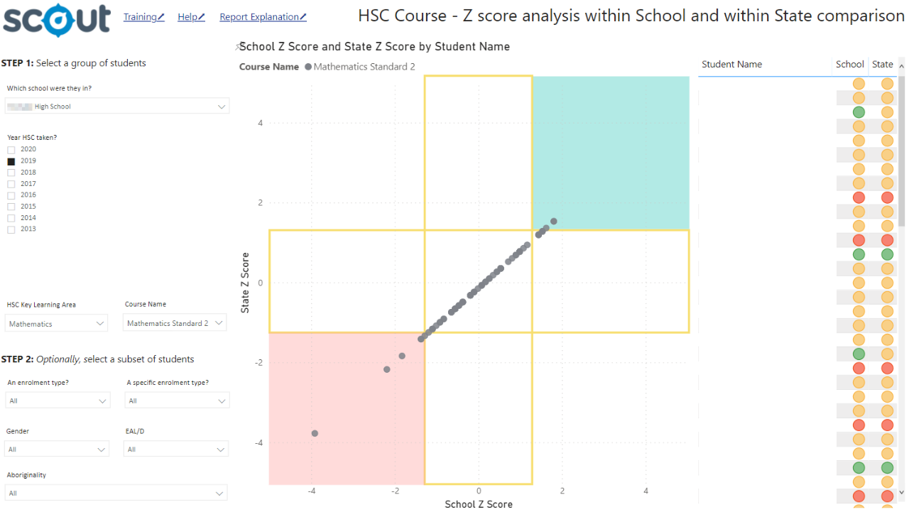
The coordinates of a student’s results indicates how they performed, as compared to both the school and the State (DoE). Within a cohort, a rough normal distribution of results is expected (indicated by evenly spaced dots from left to right). If the entire cohort performed well against the State, the middle dots will be above the coordinate 0,0 on the X and Y axis.
If there is divergence between individual students, such as positive Z score for school but negative Z score to state, this indicates their result is strong against peers within the school, but relatively not as strong as compared to the state. The opposite is also true.

Using the report
Make a selection
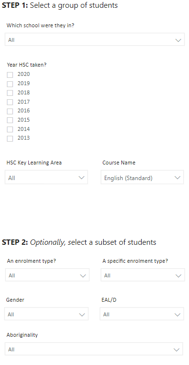
Use the drop-down menu in the top left to select a school. Select the HSC year of interest (by default this will be the most recent completed and reported HSC year).
Select a Key Learning Area and Course.
Note: the plot will display all courses in the selected set of slicers. Failure to select a KLA or course will show results for all courses in the school. If only a Key Learning Area without a course is selected, results for all courses within that KLA will display.
Each course will be disaggregated as a different colour on the plot. For the student indicator table all results for each student will be presented however the graph is intended to be used at a course level and as such does not display course name. The graphs do however work with multiple courses selected.

The indicated table can be used to select a student(s) and filter the display on the graph to just those student/s displaying individual performance in all courses undertaken by the student(s). This can be insightful in assessing a student’s results. If no course is selected the student indicator table can be used as a means of assessing a student’s results across courses, making areas of strength obvious.
Results can be further sliced to analyse results for different student groups using the enrolment type, specific enrolment type, gender, EAL/D and Aboriginality slicers.
Note: for all of the slicers, a blank selection will be treated in the same way as selecting all of the options for that slicer. For example, not selecting a Position name will display results for all positions in the school.
View the graph
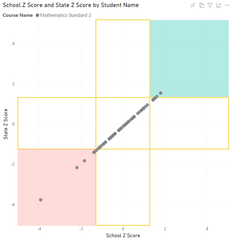
The graph plots each student in the course as a coordinate across the X axis (school Z score) and Y axis (State (DoE) Z score).
Students in the bottom left (red) corner of the graph performed more than one standard deviation below both the school and the state normalised mean, indicating a meaningful result. Students falling in the top right corner of the graph score greater than one standard deviation above both the school and the state normalised mean, indicating they outperformed their peers in the school and across the state by a meaningful amount.
Students falling within the amber cross hairs of between 0 and 1 for both the school and the State (DoE) indicates they performed at a similar level to their peers in the school and to the state normalised average. The higher a student’s data point is on the Y axis indicates increasing performance compared to the State (DoE) normalised mean. The further the student’s data point is to the right, indicates increasing performance compared to the school’s normalised mean.
Hovering over the data points provides information on the student, the course, the Z score value within the school and the Z score value within the State (DoE).

Student indicator table
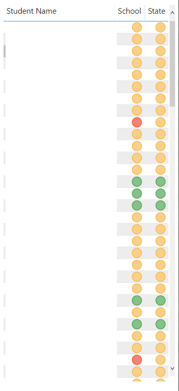
The table on the right of the report displays the results for individual students compared to school and state at a course level for the selections made in the slicers. The table presents the student’s name and an indicator for their results on the school level Z score and State (DoE) level Z score. A green indicator means the student was greater than one standard deviation above the normalised mean, an amber indicator means the student was between -1 and 1 standard deviation of the normalised mean (it is assumed that 66% of students will fall into this category), and a red indicator means the student was more than one standard deviation below the normalised mean. This display can be used to filter the graph display to view individual students or groups of students results across courses.
The default view will sort rows by student name.

Export the results
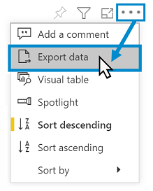
The information from within this report can be exported easily. Hover over a chart or table and select the ‘More options’ ellipsis icon once it appears. Then select ‘Export data’.
This will bring a confirmation box to download the current names in the table as spreadsheet for editing and printing.

Reset to default
If you wish to remove selections you have made and return to the initial view, select ‘Reset to default’ from the top right of the window:


Want to learn more?
· Other guides are available at the Digital Learning Centre.
· If you are having difficulty with access to a Scout App or report, please contact Support.