HSC Course - Z Score Analysis
About this report
Information
Data Sources: HSC.
Updated: Annually
Designed for
The HSC Course – Z Score Analysis report provides schools with summary of student HSC scores across a normal distribution within the school population and the State (DoE).
Benefits
How can I use this report?
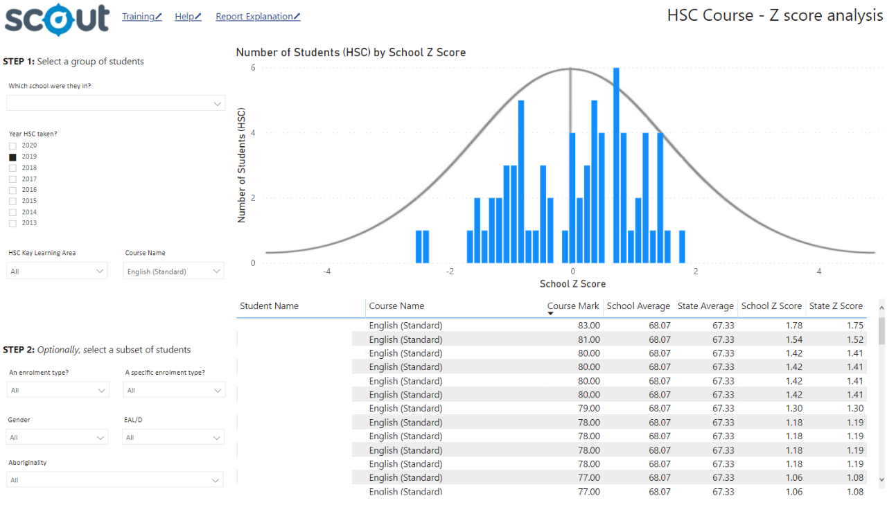
The HSC Course – Z Score Analysis report allows users to view student performance in HSC courses plotted on a normal distribution for school population as well as comparison of the performance against the State (DoE) population. Users will be able to see where the individual students’ performance fell and determine if student was above, below or within the mean (average) for the school and state comparison groups. Analysis of the number of students falling above or below the mean will assist in determining if the cohort as a whole adhered to a normal curve or if the performance of a few students ‘skewed’ the curve suggesting outliers effected the overall school performance. Graph and table data are presented to allow both a visual representation of the school results and detailed information on individual students.
Students with a Z Score greater than 0 performed better than the mean for the comparison group (school or State (DoE)), students with a Z Score less than 0 did not perform as well as the mean. Values over ± 1 indicate performance with greater than one standard deviation from the mean and can be interpreted as meaningfully different from the mean.
Teachers can use this report to assess overall class performance on the HSC as well as individual student performance. Head Teachers and Faculty leaders can assess student and overall performance for key learning areas (KLA) whilst School leadership teams and Network Directors can assess overall school performance versus the State (DoE).
What should I look for?
For Z Scores, 66% of the population is assumed to fall within one standard deviation of the mean (average).
As such students’ Z scores greater than 1 or less than -1 indicate student performance was meaningfully different from the mean. Within the school cohort a relative normal or bell curve would be expected as students are compared to their peers within the school cohort.
A ‘skewed’ curve (one where there is a long tail with a shorter tip, or short tail and long tip to the bell shape) indicates the performance of some students distorted the curve and indicates variable performance within the cohort.

Using the report
Make a selection
Use the drop-down menu in the top left to select a school.
Select the HSC year of interest (by default this will be the most recently completed and reported HSC year).
Select a Key Learning Area and Course.
It is recommended that a Course Name is also selected along with a KLA, to display a meaningful graph.
Note: Selecting a Key Learning Area without selecting a Course will populate the graph, however student results across courses will be aggregated in the graph display. This may produce unexpected results. The data in the table will be disaggregated to courses, listing results across all courses in that KLA for the cohort.
Results can be further sliced to analyse results for different student groups using the enrolment type, specific enrolment type, gender, EAL/D and Aboriginality slicers.
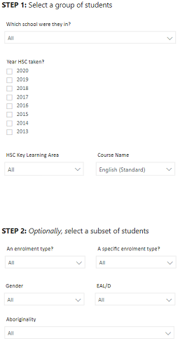

Note: for all of the slicers, a blank selection will be treated in the same way as selecting all of the options for that slicer. For example, not selecting a Position name will display results for all positions in the school.
View the graph
The graph plots a count of students for each Z score point taken from within the school cohort. The X axis shows the Z score, and the Y axis shows the count of students. In most cases, the distribution of students will form a bell shape, similar to the curve shown on the graph. The results may be negatively skewed, where the results of a few students scoring well below the mean results in a cluster of the majority of students at or above 0.
Results can also be positively skewed, where the results of a few very high performing students may result in a majority of students clustering at 0 or less.
NOTE: If the curve is positively or negatively skewed, individual student Z scores should be interpreted with caution.
Hovering over the bars provides information on the Z score value and the number of students achieving that Z score.
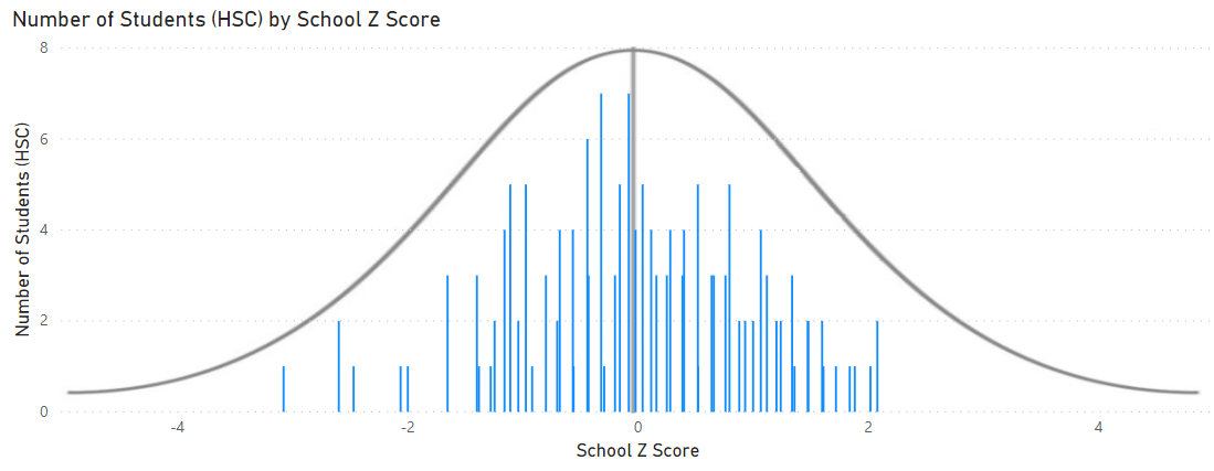

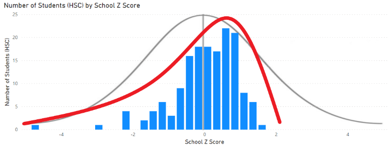

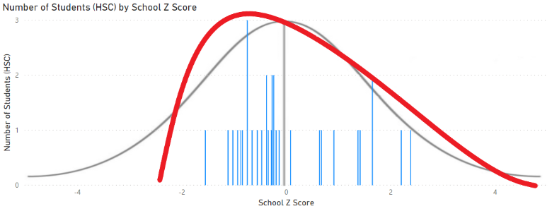

Table data
The table data displays the results for individual students at a course level for the selections made in the slicers. The table presents the student’s name, course, course mark, school average course mark and State (DoE) average course mark.
The table also shows the Z score value for the student within the school (the school population for that course used to calculate the Z score) and the State (DoE) Z score value (where the entire population of students undertaking the course across DoE is used to calculate the Z score).
If no single course is selected all courses in the selected KLA will display allowing comparison of the student’s results across courses.
The default view will sort rows by student name.


Export the results
The information from within this report can be exported easily. Hover over a chart or table and select the ‘More options’ ellipsis icon once it appears. Then select ‘Export data’.
This will bring a confirmation box to download the current names in the table as spreadsheet for editing and printing.


Reset to default
If you wish to remove selections you have made and return to the initial view, select ‘Reset to default’ from the top right of the window:


Want to learn more?
· Other guides are available at the Digital Learning Centre.
· If you are having difficulty with access to a Scout App or report, please contact Support.