Outcomes and Focus Areas
Information
Data Source: NESA
See the Key Terms page for information about data refresh and definitions of terms used.
Designed for
Teachers, Principals and school leaders, Directors, Educational Leadership and Executive Directors. The information displayed in each report will be specific to each user; for example, school staff will view their school's results.
About this report
The Outcomes and Focus Areas report details students’ progress towards achieving the overall HSC minimum standard and progress in each domain. It also allows you to view the results in detail at the level of domain, focus area or individual item.
Note: Detailed results for the writing test, such as focus area or item description, are not available from NESA.
What should I look for?
Comparing the proportions of results from one domain or focus area to another might produce useful information for teachers by highlighting specific areas requiring support.
This can be performed at an individual student level or across groups of students.
For example, when looking at the Focus Area Outcomes, are there more red-shaded boxes in one focus area within numeracy than the others? This could become an area for targeted instruction or revision.
Taken together, the results across all areas might be able to inform school processes for student readiness in preparing for their attempts. For example, when looking at the proportions in the bar chart, is there a large amount of not achieved (red) compared to achieved (green)? This may suggest students need further support before they reattempt the test.
It is strongly recommended that this report be used alongside other data sources, such as internal school test data.
Using the report
Using filters and slicers
Step 1: These slicers affect the data represented in the charts throughout the report. For teachers and executives, your school should be pre-selected; otherwise, select it here.
Step 2: These slicers are optional. They allow you to select a subset of students to refine the results further.
The report will automatically update to show results relevant to your selections. If you do not make a selection, the report will continue to display all available results.


Using highlighting in bar charts
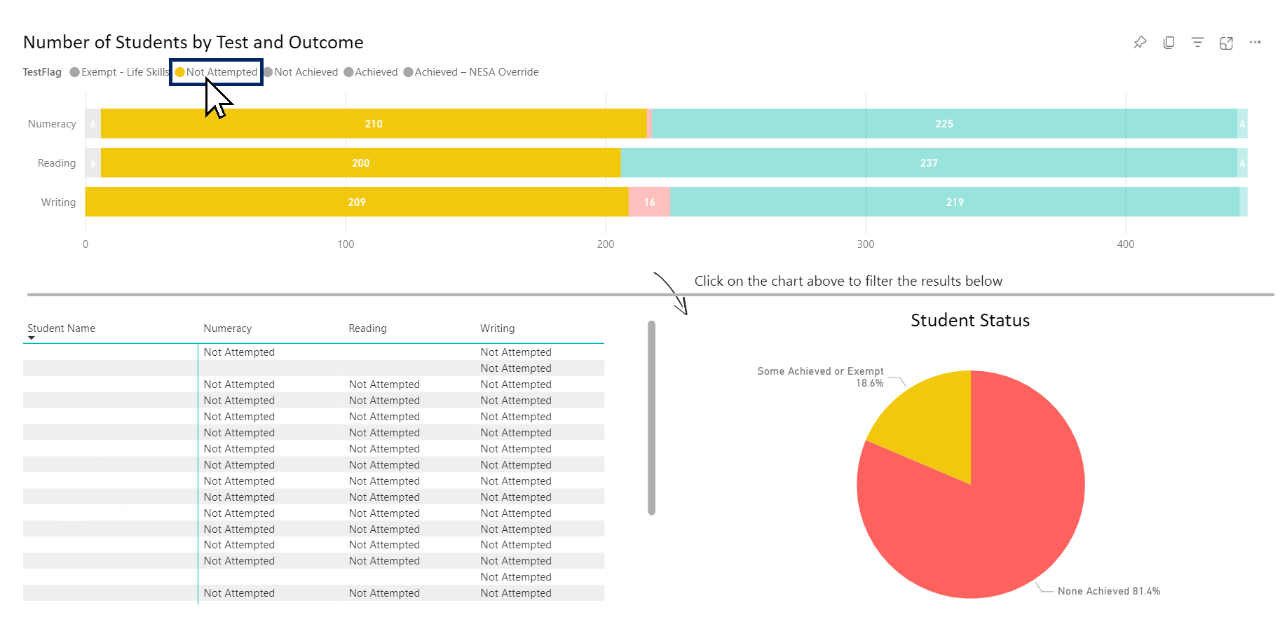
Select an element of the bar chart to highlight that data.
You can select a particular test domain (e.g. Reading) by clicking on it. This will be reflected in the table below the bar chart. The pie chart will not change as it is calculated as a total of all three domains:


You can also select a particular stage of progress (e.g. Not Attempted) by selecting it. This will be reflected in both the table and pie chart:

Making multiple selections
You can select any piece of information, and it will be highlighted throughout the report. To make multiple selections simultaneously, hold down the control (CTRL) button while selecting areas.


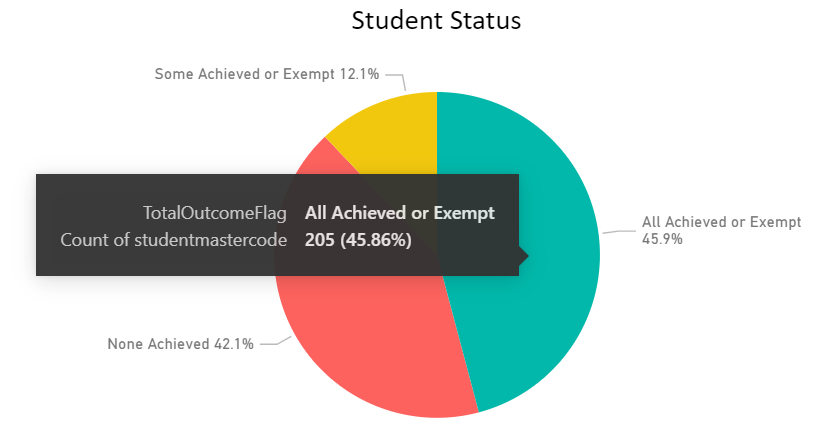
Hovering for information
Hovering the cursor above a section of the chart will display a summary for that section. The example shown is of the pie chart, but this feature will also appear on most other charts.

Report sections
Number of Students by Test and Outcome
The Number of Students by Test and Outcome bar graph shows the proportion and number of students belonging to each Domain Outcome (see Key Terms page for definition).


The table lists all selected students and their current Outcome in each domain. It automatically updates with changes in selection or by highlighting regions in the bar graph above.
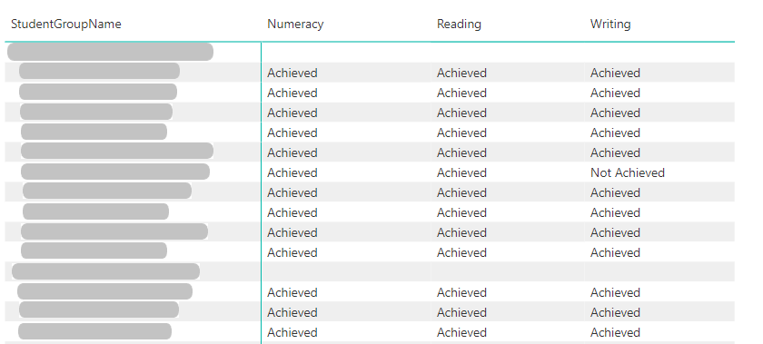

The Student Status pie graph displays the proportion of students in each Student Status.


The Student Status by Equity group bar graph shows proportions of the same categories as the pie graph but for the EAL/D and Aboriginal students. This chart does not respond to the Aboriginality and EAL/D slicers.
See the Outcome Status Detailed report for a table summary of this data.


Focus area outcomes for most recent test and all test attempts
This heat-map table displays the proportion of questions answered correctly in each focus area. Blank cells in this chart indicate a student was not shown any questions from that test domain.
Due to the time limit and the adaptive pathway of the tests, the total number of questions will vary between students. They could have been shown 0, 1 or more in any individual domain.
This is important to remember when interpreting the meaning and importance of the percentage result. For example, if a student were only shown one question in Algebra, they would only have 0% or 100% as their percentage score. If two questions were shown, 0%, 50% or 100%, and so on.
Note: Item-level information is not available for the writing test.
To toggle between seeing Most Recent Attempt and All Attempts, select the labels above the top right of the chart.
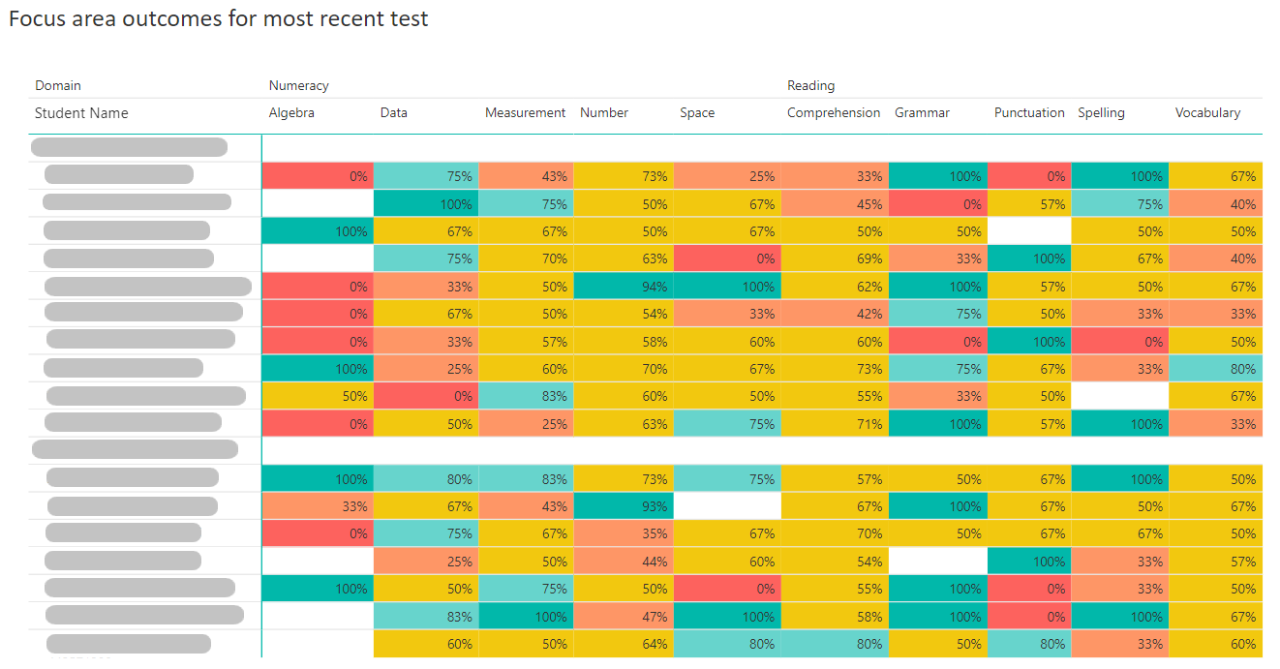

You may also Drill down using the icons in the top right. This allows you to condense focus area columns into domains.


Remember:
- By selecting one row or column, other sections will cross-highlight to reflect this change.
- Multiple selections can be made by holding control (CTRL) and selecting with your cursor.
- Your selection will be applied to both this chart and the following section.
Item descriptors for most recent test/all test attempts
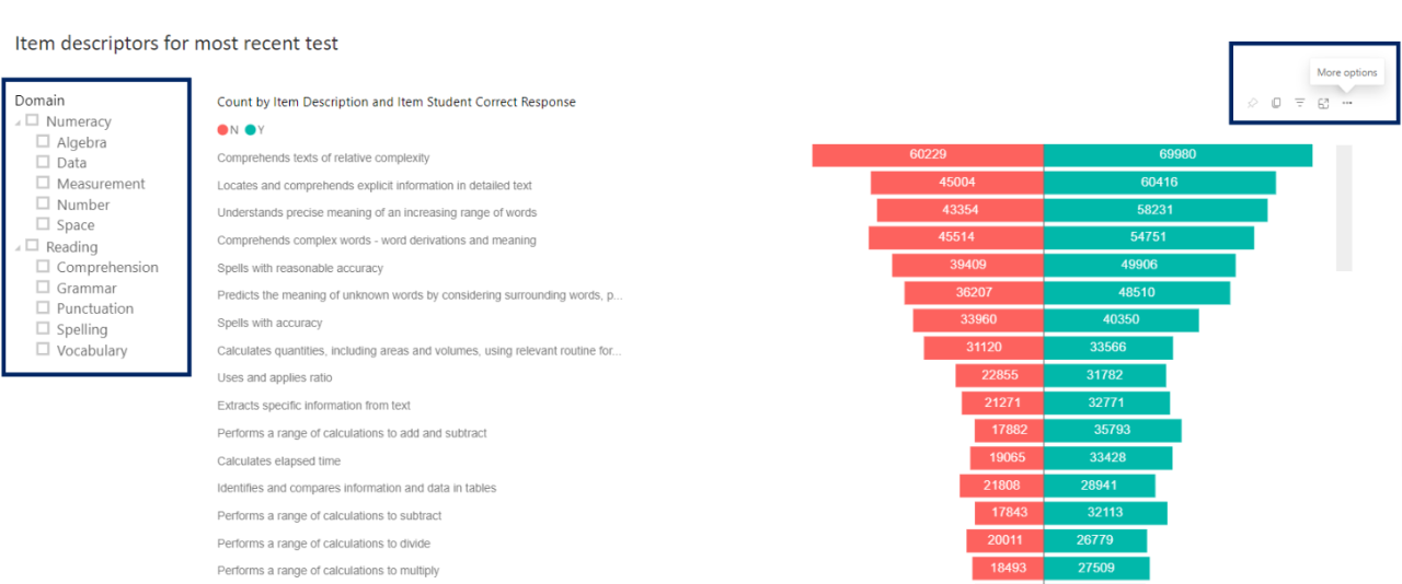
This tornado chart lists individual item descriptors from the tests and the number of correct (green) and incorrect (red) responses.
As the image below demonstrates, the slicer on the left allows you to select a domain or focus area. For multiple selections, hold control, then select.

Reset to default
If you wish to remove selections you have made and return to the initial view of the report, select the ‘back' button in the top right-hand corner of the report.


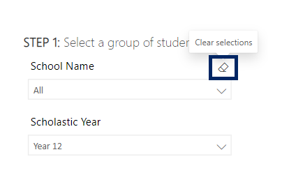
To clear an individual filter, hover over the top right of the slicer and select the eraser icon that appears. This will clear selections from that filter only.

Need further support?
- Other guides are available in the Digital Learning Centre.
- If you have difficulty accessing a Scout App or report, please get in touch with Support.