School Complexity Factors
About this report
Information
Dashboard calculated at the school level from the following datasets, averaged out per school population, and then compared to state averages for the school level:
NCCD (source: CESE)
Student metadata (source: ERN and Student Registration)
School metadata (source: CESE)
CWU (source: Communities and Justice Child Story via Child Wellbeing Unit)
ISU (source: Health and Safety Directorate)
AEDC (source: Federal Government - Australian Early Development Census via Student Engagement and Interagency Partnerships)
Updated: 2018 data and 2019 whole year summarised data.
Designed for
The purpose of this dashboard is to allow principals and school leaders, Directors, Educational Leadership, and Executive Directors, to have a greater understanding of the degree of complexity that is being experienced by NSW public schools and how a particular school may compare in their degree of complexity against the state average.
Benefits
How can I use this report?
The Complexity Dashboard report provides a visual overview of the different drivers of complexity being experienced by a selected school. It is not a measure that is likely to change much over-time, as the constituent parts represent factors outside of a school’s control.
What should I look for?
The Complexity Dashboard collects data on metrics associated with schools and school diversity such as Incident Support Unit (ISU) reports; students in statutory out of home care; students who require a disability adjustment. These metrics may indicate a level of complexity experienced within a school environment across all NSW public schools. This may assist schools when making planning decisions to address school specific areas of need.


Using the report
Make a selection
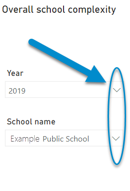
Use the drop-down menu in the top left to select a school and year. This will generate and display the report.

View the complexity metrics
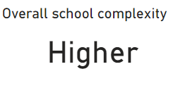
The overall school complexity is displayed at the top left as a single word label: Average, High, Higher or Highest.
(See below for definitions).

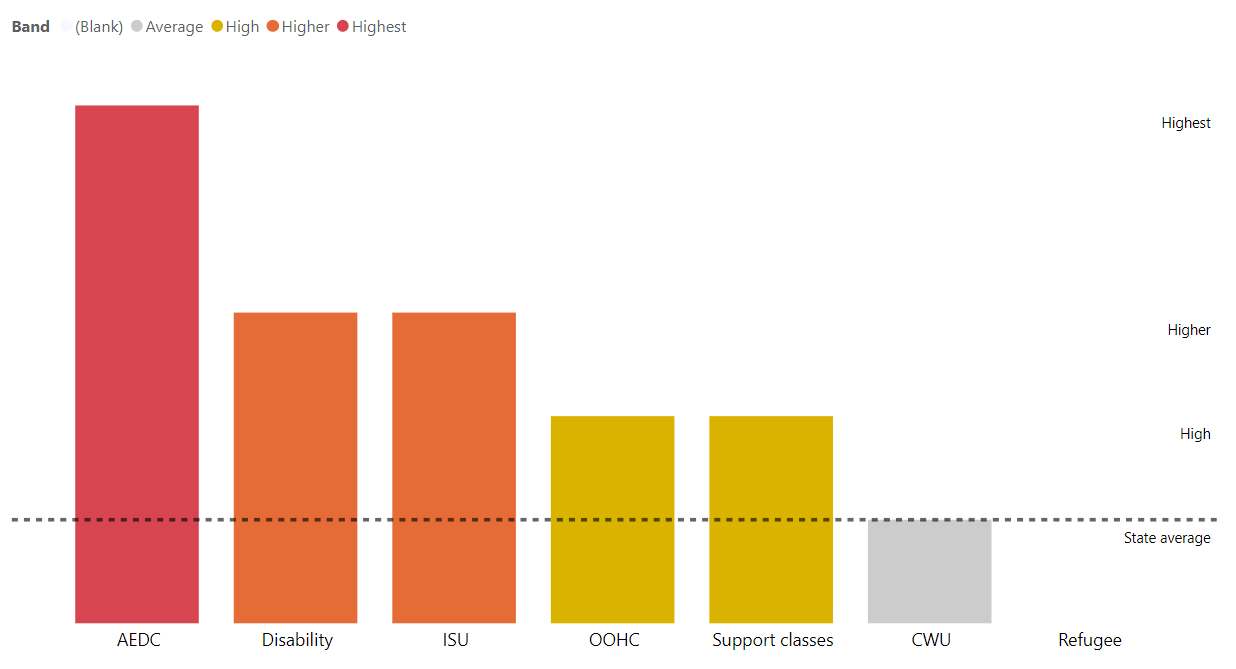
You can review the individual elements of complexity in the main chart on the screen:

Definitions of terms used in the report
School complexity elements:
· AEDC – Australian Early Development Census – Compares the percentage of children in the school who are flagged as developmentally vulnerable in more than two domains with the average for other schools. (only available for primary schools)
· CWU – Child Wellbeing Unit – Compares the number of reports made to the CWU as a percentage of children in the school with the average for other schools of the same type.
· Disability – Compares the percentage of children in the school who are reported as requiring adjustment in the classroom in the NCCD (Nationally Consistent Collection of Data) with the average for other schools of the same type.
· ISU – Incident Support Unit – Compares the number of reports made to the ISU as a percentage of children in the school with the average for other schools of the same type.
· OOHC – Out of Home Care - Compares the percentage of children in the school who are reported as being in Out of Home Care by DCJ with the average for other schools of the same type.
· Refugee - Compares the percentage of children in the school who hold a refugee visa with the average for other schools of the same type.
· Support Classes – Compares the number of support classes the school runs compared with the average for other schools of the same type.
School complexity bands:
· Average – The school compares similarly to other schools of the same type.
· High – The school has up to twice as much complexity in this element compared to other schools of the same type.
· Higher – The school has between two to three times as much complexity in this element compared to other schools of the same type.
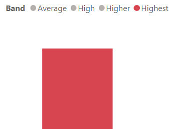
Highest – The school has more than three times the level of complexity in this element compared to other schools of the same type.
Chart features


The y-axis scale on the right of the chart displays the bands.
The state average is also indicated with a dotted line across all factors.
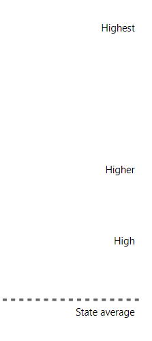

NOTE: Complexity factors in the 'Highest' category are visualised as a larger column to indicate that this category contains three times higher the relative levels of occurrence of the band.
Focus and highlight

Selecting one factor will highlight it and dim all others. Selecting one colour or band (in the example image below) will select all factors with that colour or band.

Want to learn more?
- Other guides are available at the Digital Learning Centre.
- If you are having difficulty with access to a Scout app or report, please contact Support.