School Results
About this report
Information
Data Source: Check-in assessment
Updated: After the assessment window
Benefits
How can I use this report?
The report provides information about school performance in the Check-in assessment in relation to the Check-in achievement quartiles. Schools can use this report to view performance compared to statistically similar schools (SSSG) and across DoE.
What should I look for?
The report provides schools with a view of distribution of performance in quartiles for this year group in Reading and in Numeracy. Comparisons can be made to statistically similar schools and to the state.
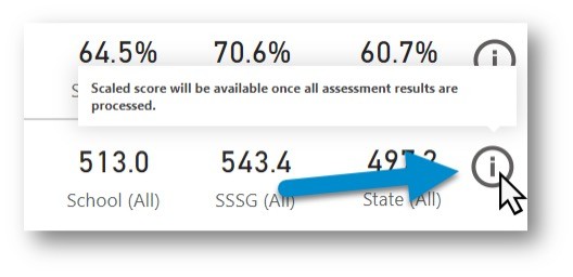
Note: Scaled scores will be available once all assessments are processed.
Check-in assessment scaled scores should not be compared to NAPLAN equivalent scaled scores displayed in the archived School Results report, or results from NAPLAN assessments.
Important information
Due to the nature of this new assessment and calculation process, there are several information icons throughout the report. Hover over these symbols to read important information notes that will appear.


Using the report
Select the results you want
The slicers at the top of the report allow you to select the results you want to be displayed.


Step 1 is required for data to be shown in the report.
Select your school and check you have the scholastic year you wish to view results for, e.g. 2022 - Term 4 - Year 5.
Step 2 is optional and allows for further refining by enrolment groups, EAL/D, Gender and/or Aboriginality if you want to do so.
If you do not make any selections in Step 2, the report will continue to show all results available to you under each of these categories.
View the charts
Your selections will automatically be applied to the charts.
The charts: Average Check-in score for Academic year and Percentage of Students in each Quartile over time for Academic year are school level results and will not change with options chosen at Step 2.
School Summary
This section of the report will provide a quick snapshot of the number of students who participated in each assessment and the percentage of correct items across the school compared to statistically similar schools and the State DoE for each domain. (The 'Students Assessed’ will be coloured red if there are a small number of participating students to suggest that results are to be viewed with caution as they may be less reliable).
Scaled scores are based on weighted average of questions asked in each domain and compared against school, SSSG and state.


Note: Scaled scores are also available in the Cohort Performance and Student Item analysis reports after the assessment window closes and scaled scoring is completed for all schools.
School Comparison to SSSG & State
The bar chart displays the percentage of students in each quartile grouping (lower group, middle lower group, middle upper group and upper group). The percentage of students in each quartile grouping at the selected school is compared to the SSSG and state.


Student Scaled Scores and Quartiles by Domain
This table presents students alongside their quartile grouping and scaled scores. There is a table for Reading and another for Numeracy. The tabs across the top of each table can filter the list to only one quartile grouping. Columns can be sorted by clicking on their title/header.


Scores over time – Average Check-in score for Academic year
This chart shows the average check-in scaled score for the Semester 2 assessment, compared to statistically similar schools and the State for each domain. It shows Academic year for the assessment selected at Step 1 (e.g. Year 5 students in each calendar year).
Note: This chart will not respond to student group selections at Step 2.


Percentage of Students in each Quartile over Time for Academic year
This chart shows Academic year for the assessment selected at Step 1 (e.g. Year 5 students in each calendar year). It presents the percentage of students achieving each quartile in the Semester 2 assessment.
These values are based on quartile cut points that were set for the baseline year (2021). Due to this, the values for subsequent years will differ slightly from those shown in the School Comparison to SSSG and State which are for that particular assessment event.
Note: This chart will not respond to student group selections at Step 2.


Notes about the Check-in measurement scale
The Check-in measurement scale has been developed to support schools to monitor student learning progress. It has been developed in conjunction with the Australian Education Research Organisation (AERO).
The Check-in assessments are reported on two scales, one for Reading and one for Numeracy. The Check-in scales are developed using the Terms 3 & 4 2022 assessments, which were designed for all year level cohorts to be placed on the same scale. Common items between Terms 3 & 4 in 2022 and Term 4 2021 allows for the previous assessments to be equated onto the Check-in scales established in 2022. This allows for comparisons to be made between assessments across calendar years (2021 to 2022), and across scholastic years (Year 3 to Year 4).
The Check-in scale provides a valid and reliable measure of student performance allowing for direct comparison of progress over time.
Using the scale, schools can look at how
• a cohort has performed in comparison with SSSGs and state performance.
• academic year groups are performing with a year-by-year comparison.
This information can be considered alongside other data on student learning to support school planning and monitoring processes.
Check-in assessment student scaled scores over time
Scaled scores for individual students may fluctuate over time, for instance in Check-in assessment between semesters or between years. This may be due to the following reasons:
- Not all students learn at the same rate, or at the same rate in different scholastic years
- Due to optional participation in 2020 and Term 2 2021, there is incomplete coverage for all students in NSW.
- Depending on the size of a school, the number of students within an assessment cohort may be small. Smaller schools should exercise caution when interpreting results for small groups of students.
Notes about the applicability of Check-in scaled scores
Term 4 2022
Scaled scores are available on the Check-in scale.
Term 2 2022
Scaled scores are not available for Term 2 2022 on the Check-in scale.
Term 4 2021
Scaled scores are available on the Check-in scale.
Term 2 2021
Scaled scores are not available for Term 2 2021 on the Check-in scale.
Term 4 2020
Scaled scores are not available for Term 4 2020 on the Check-in scale.
Need further support?
- More information about using Scout reports, including how to export data, is available at How to use Scout.
- Other guides are available in the Digital Learning Centre.
- Please get in touch with Scout support if you have any questions or difficulty accessing Scout reports.