Student Differentiation
About this report
Information
Data Source: Check-in assessment
Updated: After the assessment window closes
Designed for
Principals, school leaders and teachers can use this report to explore how the students have performed by domain (e.g. reading & numeracy) and view performance by syllabus stage. Directors, Educational Leadership and Executive Directors can view each school within their network.
Benefits
How can I use this report?
The Student Differentiation report allows schools to analyse student groups by performance in reading and numeracy assessment scores by stage and syllabus outcomes. Up to five clusters will be created, automatically grouping students with similar scores. Student results are included to analyse each cluster at levels of domain (reading or numeracy), area of learning and stage.
What should I look for?
The report provides automatically generated suggestions of potential student grouping based on performance in the Check-in assessment. Visual representations of these groups, or clusters, can be explored by scrolling down to the tables for more detail. This report is intended to assist with planning for the differentiation of teaching.
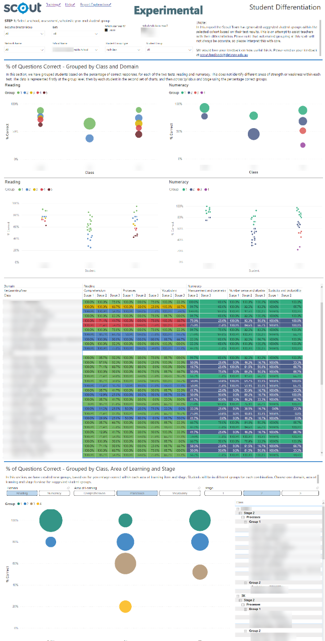

Note: the Student Differentiation report extends beyond the initial page view and its entire length can be viewed by scrolling in your browser window.
Using the report
Select the results you want
The slicers at the top of the report allow you to select the results you want to be displayed.


Step 1 is required for data to be shown in the report. Select a school and check you have the scholastic year and domain you wish to view results for, e.g. Year 5 and Reading.
Step 2 is optional and allows for further refining by enrolment groups, EAL/D, Gender and/or Aboriginality if you want to do so.
If you do not make any selections in Step 2, the report will continue to show all results available to you under each of these categories.
View the charts
Your selections will automatically be applied to all charts.
% of Questions Correct – Grouped by Class and Domain
The first graph provides a high-level snapshot of the clusters representing groups of students based on similar % correct for selected roll class/es in each domain:
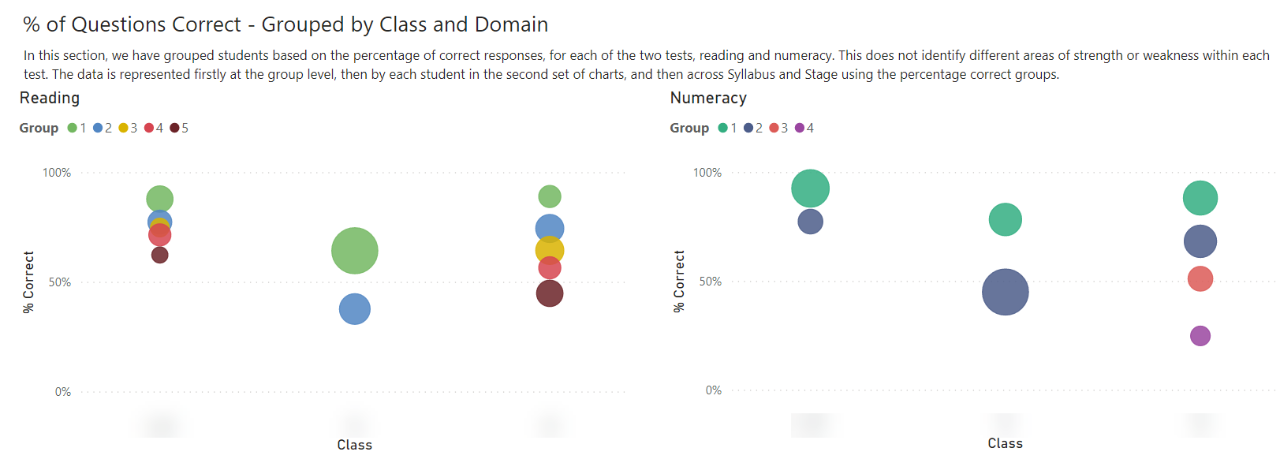

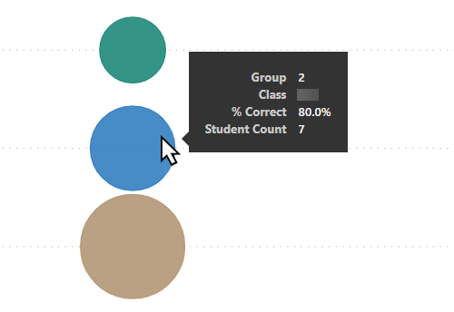
These clusters are represented by circles for each grouping. Hovering over each circle will bring up a text box detailing the number in the group and the average % correct. The circles are colour coded to correspond with individual students in the graph below.


Student Performance by Syllabus Outcome
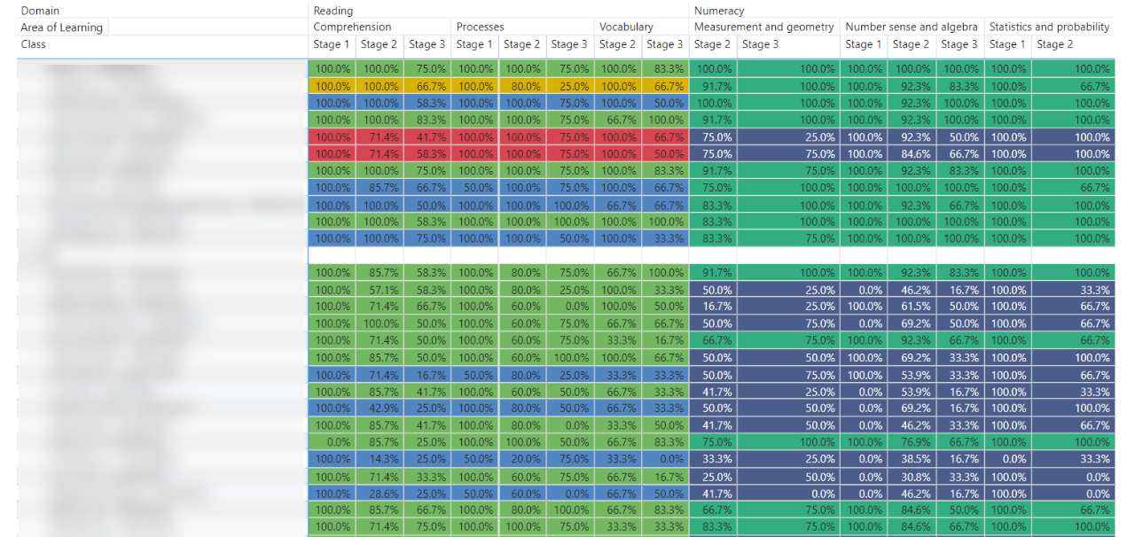
This table shows details for every student, colour-coded by their group/cluster. Student names display on the left side of this table.
The details include the correct response percentage by Area of Learning and Stage for each domain of the selected scholastic year.

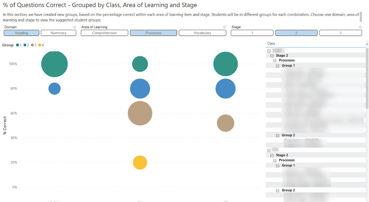
% of Questions Correct – Grouped by Class, Area of Learning and Stage
This interactive visual represents groups by percentage correct for the questions assessing each Stage. There are additional options to select Domain, Area of Learning and Stage. These options can be changed by selecting the headings across the top of the report and will result in different groups being shown. The names of students will be arranged under each group in a table to the right of the visual.
In the example image below, students have been grouped based on their responses to the Reading assessment, for items related to the Processes Area of Learning at the level of a Stage 2 syllabus outcome.

Highlight and hover
You can click on a particular region of the chart to cross-highlight related information throughout the rest of the report.
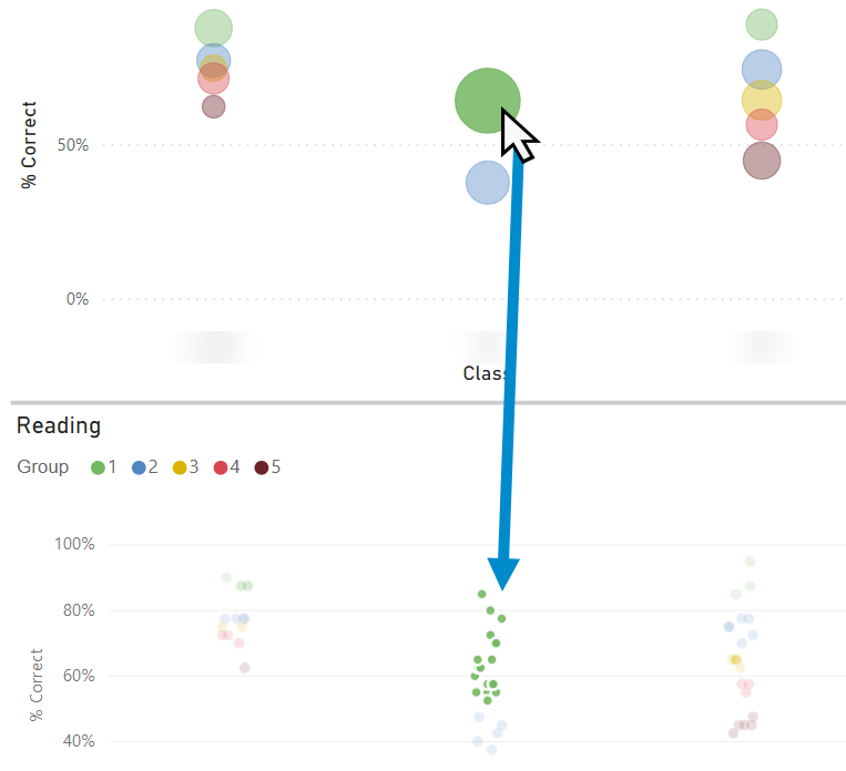

Hovering over particular segments of the visuals will bring up a brief summary of the information represented in that region.

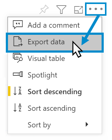
Export data
You can download the results in this report for further analysis using the ‘More Options’ tab, which appears when you hover above the top right of some charts. Click on the three dots, or ellipsis, to bring up the menu, then select ‘Export data’.

Reset to default
If you wish to remove selections you have made and return to the initial view of the report, select ‘Reset to default’.


Need Further Help?
- Other guides are available in the Digital Learning Centre.
- If you are having difficulty with access to a Scout App or report, please contact Support.