Utilisation Dashboard
Web traffic to the Universal Resources Hub (URH) website is displayed in the URH Utilisation Dashboard. URH Utilisation is presented in two ways:
- Usage by Content/Resource (Resources Overview, PL Clicks)
- Usage by School/User (Networks and Schools, Map of Users, User Searches)
For the data sources powering each report page and/or visualisation and metric definitions, please refer to the Glossary, which is also available as a direct link on each report page.
Row Level Security (RLS) is active on this dashboard. This will affect the data available on all report pages. Users limited to seeing information from specific content areas or geography will have no restriction; all other pages may have some limitation on the data available depending on the level of access granted to an individual dashboard viewer.
Networks and Schools
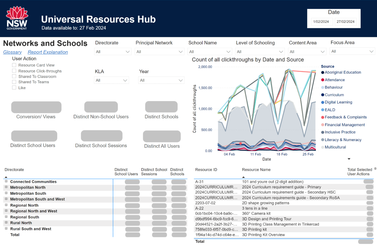

The information shown in the KPIs and tables may be filtered to a single URH user action (or combination of actions) using the available selections on the left-hand side of the page. Holding down 'Ctrl' while clicking will allow for multiple selections to be made. Both tables may be sorted by any column shown in the header of each table.
Drill-down view options are available for the left-hand table as school information is presented in a hierarchy. Users may utilise the plus and minus arrows next to bolded items in the table to collapse or expand selections. It is also possible to expand, collapse and/or drill down on all items at once by hovering over the table and selecting one or more of the following four icons from the top right-hand corner of the table:
- Drill up: Collapse one level of the table. In the image of the table above, clicking this once would collapse school name information up to the Principal Network level and clicking twice would collapse the details up to the Directorate Level.
- Drill down: When this option is toggled on, clicking a particular item in the table will drill down to that selection/level and filter on that item.
- Go to the next level in the hierarchy: Drills down one level, showing all information at one level lower in the hierarchy.
- 'Expand all' one level down in the hierarchy: Rather than drill down a level, this expands the information down one level while keeping a view over the level above. The default view for dashboard viewers has used this button twice to show all information at all levels.


Only schools with at least one user visiting the URH (and depending on RLS, users visiting resources within a given dashboard viewer’s Content Area) within the selected date period will be shown.
Resources Overview
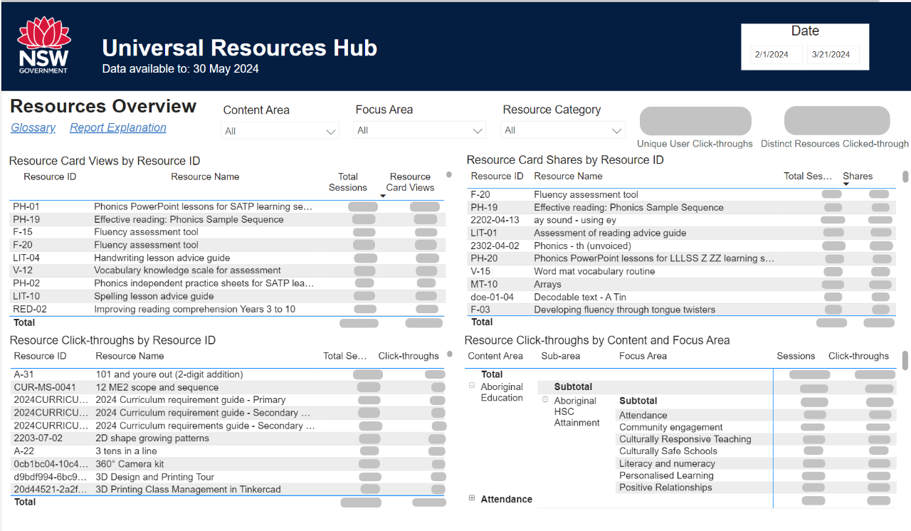

All tables can be sorted by metric (e.g. Total Sessions or Resource Card Views in the first table) and by the Resource ID and Resource Name columns. Sorting and applying filters will only affect the view of one individual user and will not change the visualisation for any other users.
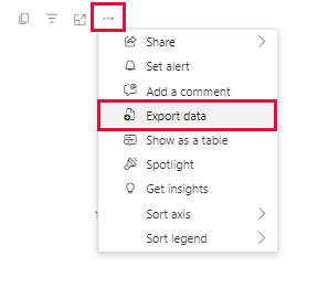
Data can be exported from tables using the context menu from the three dots in the top right-hand corner of each visualisation.

For users with no limitation placed on their Row Level Security, usage statistics for all resources will be shown. Users from specific content areas will only be able to see the usage for their given Content Area; for example, users from Literacy & Numeracy will see the usage of resource PH-19 above but will not see the usage for the 3D Printing-related resources as they fall under the STEM.T4L Content Area.
Professional Learning Clicks
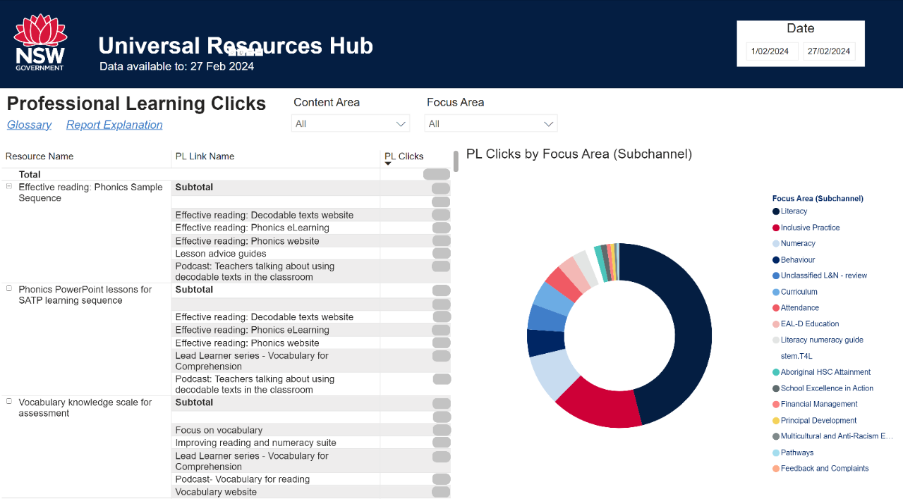

PL (Professional Learning) Clicks supplies information on the use of links to (primarily external) professional learning that is related directly to a given resource. The left-hand table supplies usage of PL Links at the level of individual resources, while the right-hand donut chart gives a breakdown by Focus Area.
The right-hand visualisation has a drill-down functionality that can be turned on by selecting the down arrow icon in the top right-hand corner of the visualisation. The arrow will be highlighted when this drill-down functionality is enabled.


Left-clicking on the donut chart when the drill-down is enabled will filter to the focus area clicked, showing the overall aggregated use of PL Links from all Resources. The final level then filters to a single PL Link level, revealing the resources from which the PL Link has been used. These two visualisations are interactive; thus, a selection of one will affect the other.
Note: Where no PL Clicks have been made, either due to limited interaction or by the resources visible for a given Row Level Security (RLS) or filter selection having no PL links available, this page's visualisations may appear blank.
Map of Users
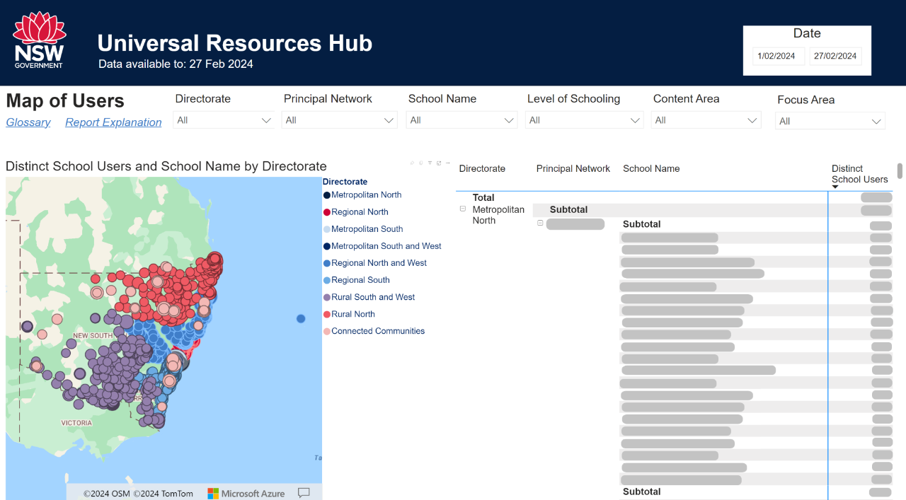

In contrast to the Networks and Schools page, this table shows the number of users at all schools, including those with zero users for the applied filter selection(s). The map visual, however, only shows those schools with at least one user, with the bubble size dependent upon the total number of users at a given school. The map will automatically zoom to the geographical extent of the filter selections and can be adjusted using the mouse scroll wheel.
User Searches
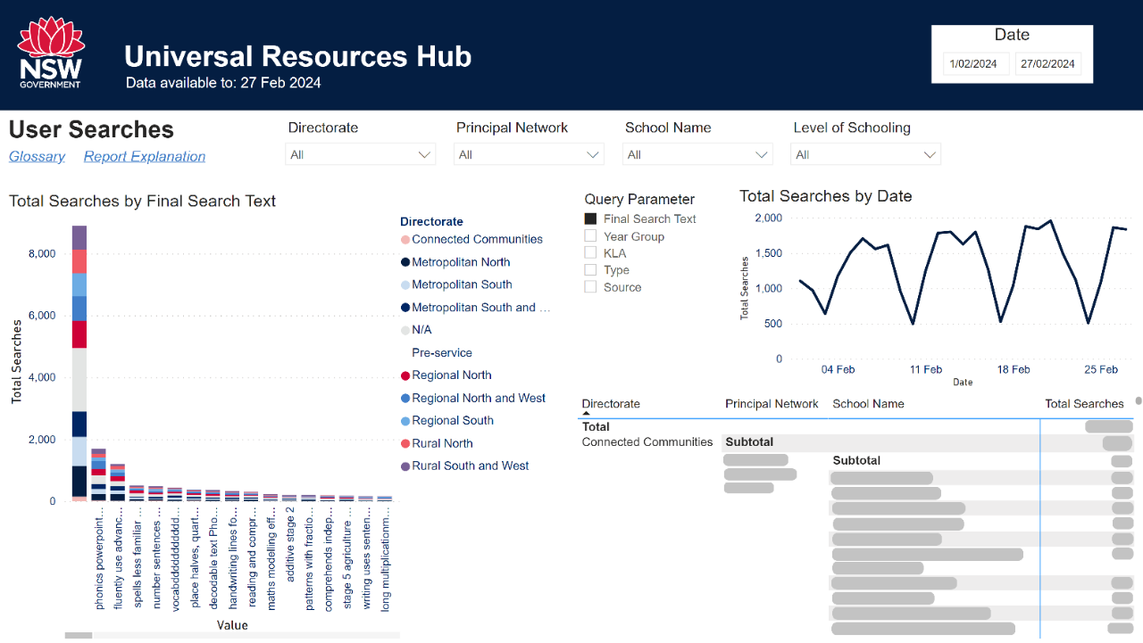

Whenever a URH user selects at least one filter and/or enters a search term into the URH search bar, a log is made of this search. The total number of searches is then aggregated into the view above. The Final Search Text selection is the longest search string entered, as functionally, the URH offers new search results as each letter is typed after three or more characters have been entered into the search bar. The star (*) character after these free-text searches is a wildcard character, allowing partial words to still return meaningful results for a URH user.
All other query parameter filter selections map directly to filters available to users when searching. Single or multiple selections of query parameters can be made. More options are available to URH users than are currently shown in the dashboard, as extra options have been made available in Release 4.0 of the URH that were not available during the development of this dashboard.
The data on this page only shows what searches have been made by a user from a given school – the search outcome is not available as part of this view.