Cohort Performance
About this report
Information
Data Source: Transition to Year 7 assessment
Updated: Daily (during the assessment period – Term 1, Week 3 to 11).
Designed for
Teachers, Principals, and school leaders can use this report to explore how the cohort has performed in the schools that participated in Transition to Year 7 assessment for a given year for Reading and Numeracy.
Directors, Educational Leadership and Executive Directors can view all schools within their network.
Benefits
How can I use this report?
The Cohort Performance report will assist schools to identify students as being in need of additional support in reading or numeracy. The summary data can be sliced by Stage (at the top of the screen) to identify performance at Stages 1, 2, 3, and 4 of the relevant syllabus. The use of this report will support reporting against School Excellence Framework elements.
What should I look for?
The purpose of the Transition to Year 7 assessment is to identify student’s current needs and areas of strength. The Cohort Performance report allows schools to get a high-level overview of the performance of students who participated in Transition to Year 7 assessment including areas of greatest strength and weakness for the cohort and individual students.


Using the report
Select the results you want
The slicers at the top of the report allow you to select the results you want to be displayed.
Step 1 is required for data to be shown in the report. Select a school
Check you have the year and domain you wish to view results for, e.g. Year 2023, Reading.
Step 2 is optional and allows for further refining by enrolment type, group type, student group, EAL/D, Gender, and/or Aboriginality if you want to do so.


If you do not make any selections in Step 2, the report will continue to show all results available to you under each of these categories.
View the charts
Your selections will automatically be applied to all sections of the report.
Summary
This section of the report will provide a quick snapshot of cohort performance by domain.
Number of students participated in the assessment, average score, max possible score, and average % correct of questions attempted by the selected cohort.
A horizontal bar chart displays % of questions correct by Area of Learning and also displays correct and incorrect colour matchbox by area of learning.


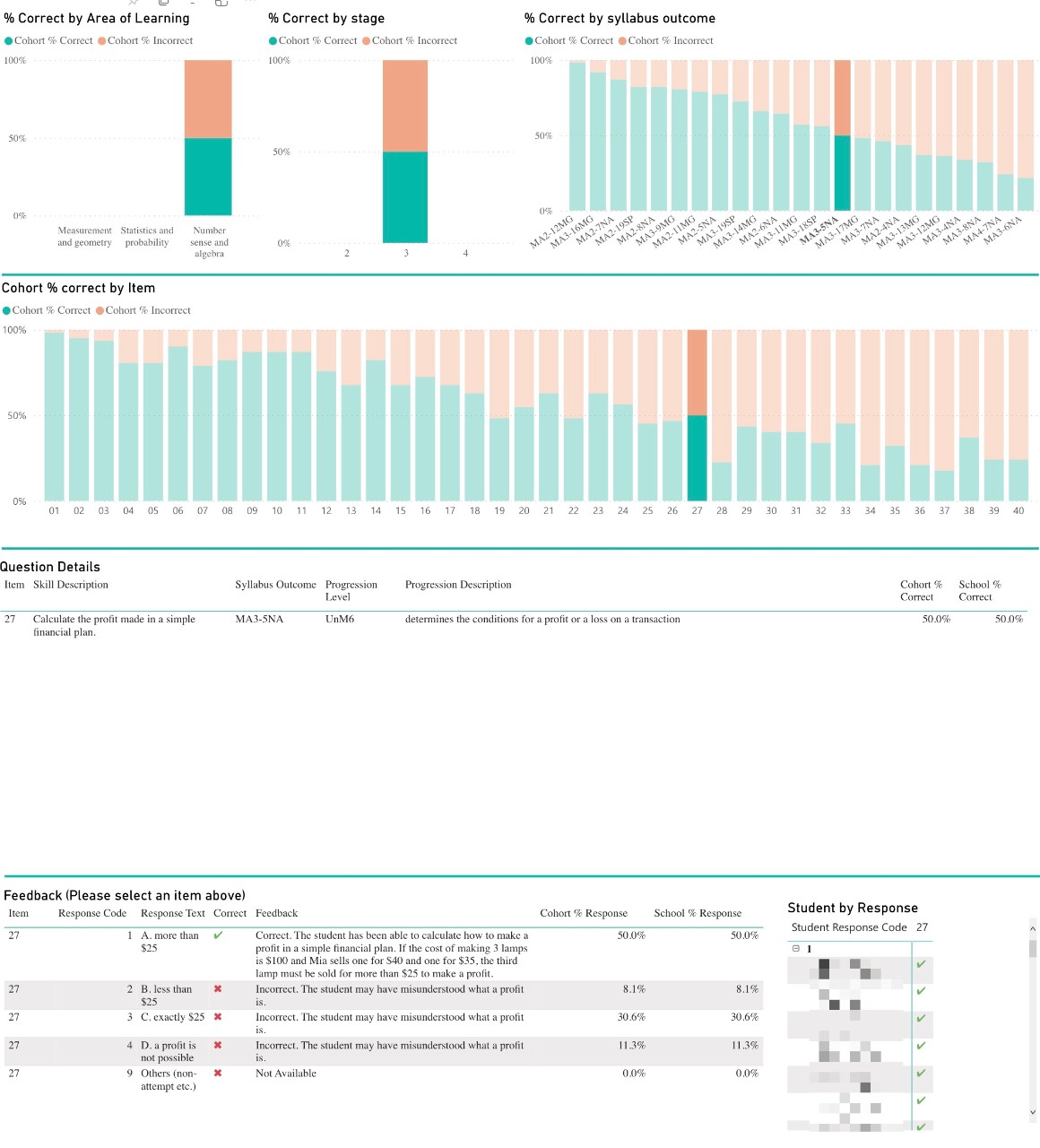
Performance by Area of learning, Stage & Syllabus Outcome
This bar chart provides the overview of cohort performance by area of learning, stage and syllabus outcome for each domain of the selected cohort.


Cohort % Correct by Item
This section provides a 100% column bar chart to display the cohort % of questions correct by each question for each domain of the selected cohort


Question Details
This table displays all questions in the assessment and cohort’s response to each question along with question level details such as teaching Strategy link, syllabus outcome, progression level, progression description area of learning, and % correct for each domain:


Feedback
This table displays feedback (Distractor details) of the responses options for all the questions for each domain of the selected cohort:


Student Item Map
This table displays all the students of the selected cohort and response correctness by questions for all the questions for each domain:
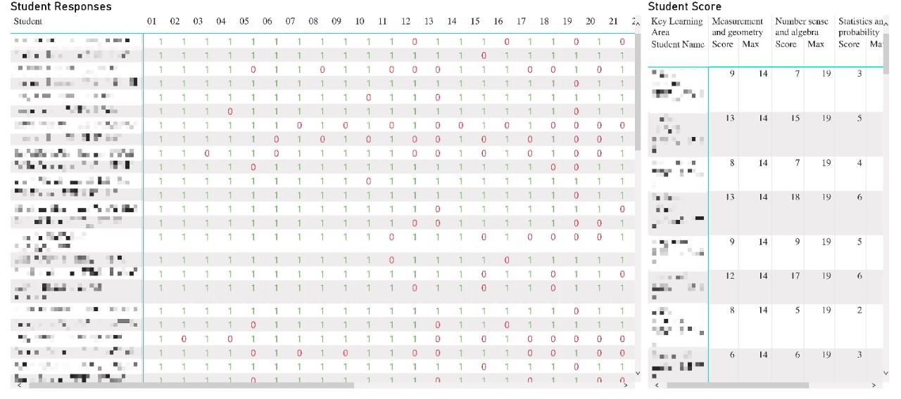

Highlight and hover
You can click on a particular region of the chart to cross-highlight similar information throughout the rest of the display.
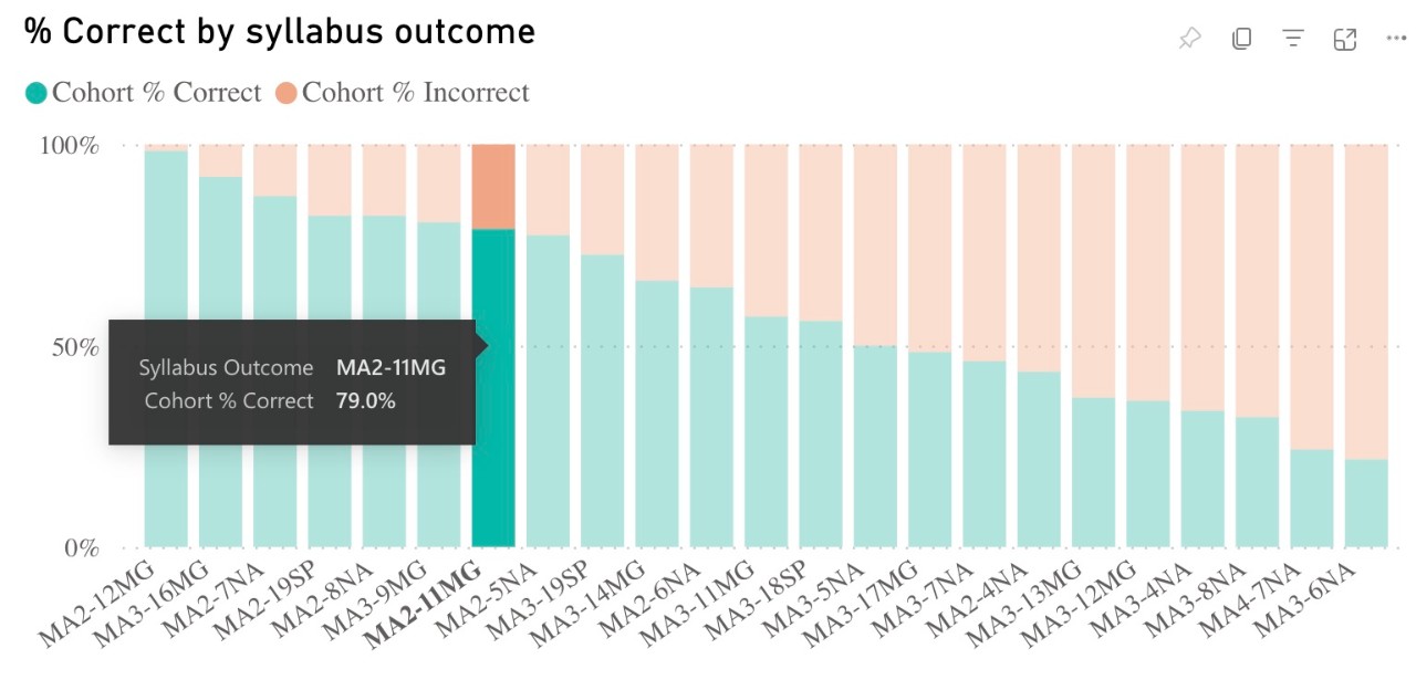
Hover over any segment of graph will bring up a brief summary with Syllabus outcome and % of correct or incorrect responses.

Hover over any segment of the graph will bring up a brief summary with Syllabus outcome and % of correct or incorrect responses.

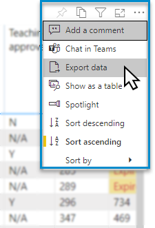
Export data
You can download the results in this report for further analysis using the ‘More Options’ tab on the top right of some charts. Click on the three dots, or ellipsis, to bring up the menu, then select ‘Export data’.

Reset to default
If you wish to remove selections you have made and return to the initial view of the report, select ‘Reset to default’.


Need Further Help?
- Other guides are available in the Digital Learning Centre.
- If you are having difficulty with access to a Scout app or report, please contact Support.