What Works Best
About these reports
The 'What works best' reports, produced by the Centre for Education Statistics and Evaluation (CESE), outline eight themes of effective teaching practices for the classroom that enhance student outcomes and drive school improvement.
They show how schools are performing across each of these themes: high expectations, explicit teaching, effective feedback, use of data to inform practice, assessment, classroom management, wellbeing and collaboration.
Information
Updated: Annually
Data Sources:
- Tell Them From Me student surveys, snapshot 1 (Terms 1 and 2)
- Tell Them From Me teacher survey (Terms 3 and 4)
- School Excellence Framework Self-Assessment
Note: To protect student and teacher confidentiality, data has been supressed where fewer than 40 students or fewer than 5 teachers answered a question.
Designed for
All reports within the What Works Best app are viewable by Head Teachers, Principals and School Leaders, Directors, Educational Leadership and Executive Directors. The information displayed in each report will be specific to the respective user; i.e. school staff will be able to view results for their own school.
Benefits
How can I use these reports?
The reports highlight which What Works Best practices are evidenced across the school, based on the experiences of teachers and students. They can be used to support the School Excellence Framework self-assessment process and help schools decide on actions to take to improve key practices. The reports are best used in conjunction with What Works Best in Practice and What Works Best: 2020 update.
What should I look for?
Each thematic report provides a summary indicator and student and teacher responses to specific questions about What Works Best practices. This allows tracking school progress towards increasing the proportion of students and teachers who report positive outcomes, and to highlight a school's strength and areas for improvement.
The reports also highlight data that can support self-assessment for elements of the School Excellence Framework that link to each theme.
School results can also be compared to a statistical similar school group (SSSG) as well as to the NSW average. The scatterplot (available for all themes except wellbeing) also allows for comparison with other schools in the same network.
Note: A school’s SSSG is calculated by using up to 40 schools with the closest FOEI to represent similar socio-economic contexts.
Each report also includes text fields describing the purpose of each chart as well as questions to guide reflection on the data. References to What Works Best in Practice are also provided.

Note: The Wellbeing report is not identical to the Wellbeing Target reported on in the School Dashboard, instead highlighting several different TTFM measures that encompass wellbeing and the ways schools can support it.
Viewing the reports
Select the report you want
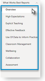
The navigation menu on the left provides a list of all the available reports, beginning with an overview summary report and followed by a report for each of the eight themes. Selecting a report will refresh the page with the newly selected report now displayed.

Selection slicers
The slicers in each report allow users to select a school in order to see results.
Note: School Type needs to be set to either Primary or Secondary for central schools to see the data.
For the student survey only, you can filter results further by scholastic year, gender and Aboriginality (as self-reported by students when completing the survey).
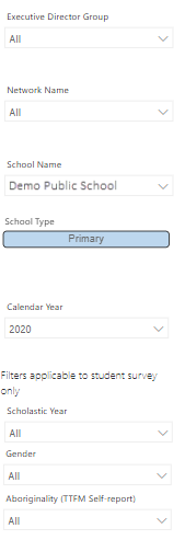

Note: Using the slicers to drill down on the data by scholastic year, gender or Aboriginality will reduce the cohort size and may result in data suppression for smaller schools.
Overview
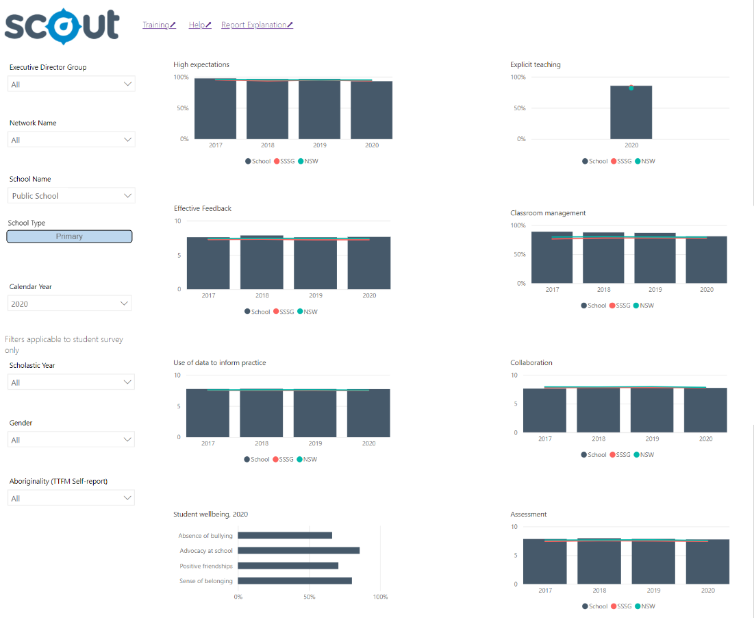
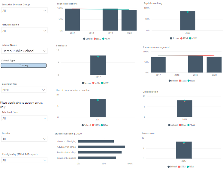
This report displays the leading chart of each thematic report to allow schools to view their results over time across the eight What Works Best themes.

Thematic reports
Individual reports for each theme allow schools to explore what effective practice looks like in their school and to reflect on which specific strategies are being used and could be the focus for improvement. The eight reports follow a similar presentation, with some exceptions for the Wellbeing report. The common features include:
Students’ or teachers’ report by year
The leading column chart in each report presents an overview measure of each theme. This will represent either the percentage of students reporting positively or the mean score for teachers (0-10 scale) depending on the theme. This chart displays data for each available survey year over the past five years. The slate bars present the results for the selected school; the red line for a statistically similar school group (SSSG); and the green line for the NSW average.
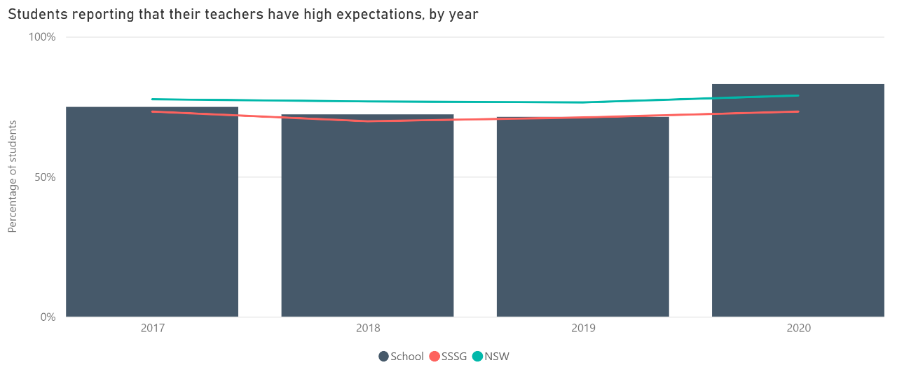

Note: Explicit teaching is only available from 2018 for secondary schools and from 2020 for primary schools. The Wellbeing report provides data for multiple measures for one selected year only.
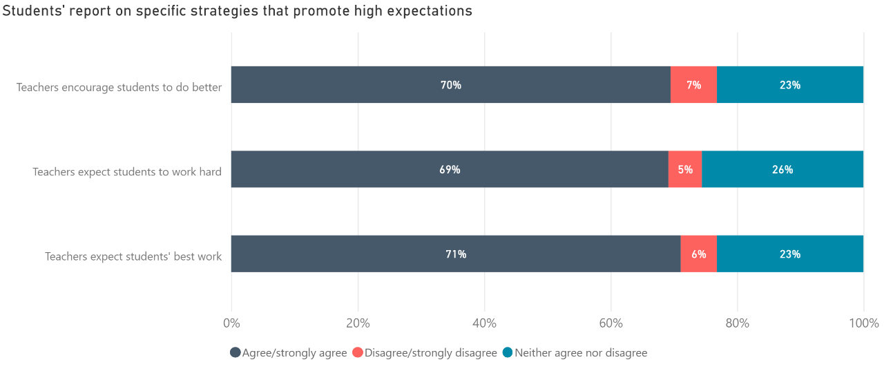
Students’ report on specific practices
These bar charts present the range of student responses on specific classroom practices for the selected survey year and student characteristics.
This chart may not display if fewer than 40 students answered the questions (see Data sources).
Note: The reports for Use of Data, Collaboration and Assessment do not include student data.

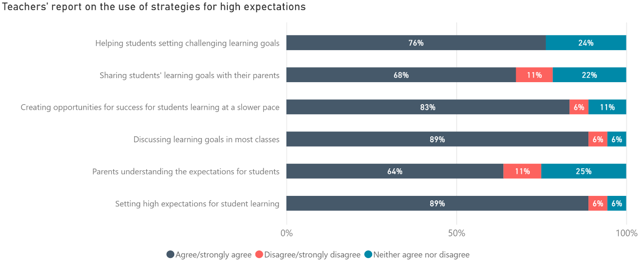
Teachers’ report on the use of specific strategies
This bar chart presents the range of teacher responses on classroom practices relating to each theme for the selected survey year.
This chart may be empty if fewer than 5 teachers answered the questions (see Data sources).

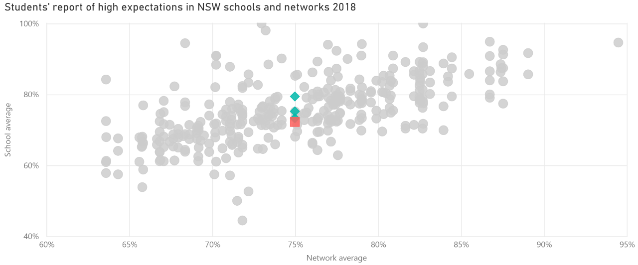
Students’ or teachers’ report in NSW schools and networks
This scatter plot presents the percentage of students reporting positively, or the mean score for teachers (0-10 scale), for each theme in the selected school (red square) in relation to other schools in the same network (green diamonds) and to all other schools in NSW (grey circles). To compare the values for the school, network and NSW averages, hover over the red square.
Note: This chart is not available in the Wellbeing report.

Links to the School Excellence Framework
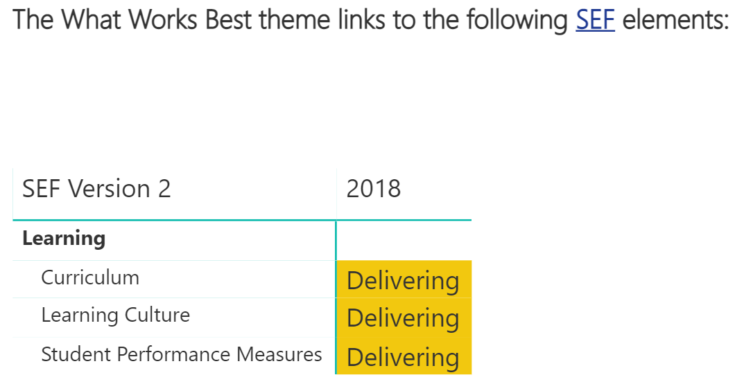
The final section presents how the data in this Scout report links to the elements in the School Excellence Framework and reports results of the school’s self-assessment.

Other tips
Highlight and hover
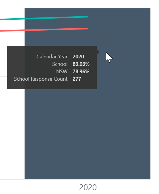
Hovering the cursor above a section of the chart will display a summary for that section. The example shown is of student report by year but this feature will appear on most other charts as well.

Export data
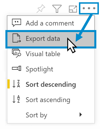
You can download the results in this report for further analysis using ‘More Options’ tab on the top right of some charts. Click on the three dots, or ellipsis, to bring up the menu, then select ‘Export data’.

Reset to default
If you wish to remove selections you have made and return to the initial view of the report, select ‘Reset to default’.


Need Further Help?
- Other guides are available in the Digital Learning Centre.
- If you are having difficulty with access to a Scout App or report, please contact Support.