Scout reports contain various types of charts and tables to help you view data and information in a visually meaningful way and support your understanding of the information in a report.
Hover for more information
Due to the scale of some graphs, it can be difficult to gain a precise understanding of the data.
By hovering over any chart segment, a pop-up box of summary information will appear in which the details of each grouping are visible.


View as a table
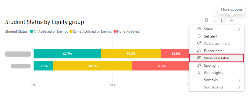
If you prefer to access information in a table format, hover over the top right-hand corner of the graph or chart to reveal an ellipsis (three dots).
Select the ellipsis (...) and then select ‘Show as a table’.
This will take you to a new view, which provides the information in table form.

Cross-highlighting
You can use cross-highlighting to view data subsets, enabling easy comparison across all charts in the report.
The cross-highlighting function is particularly useful in a report with several graphs and/or tables. By identifying a specific focus item on one graph or table, you will see it reflected across the remaining graphs and tables in the report.
Select any column on a chart to trigger cross-highlighting.
To clear your selection, select the item again.
Holding down the control key (ctrl - Windows) or command key (cmd - Mac) on your keyboard allows you to select multiple items to cross-highlight at once.


Vertical scrolling
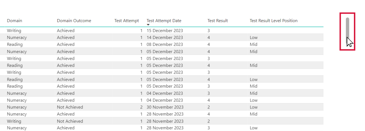
Some Scout reports contain vertical scrolling, allowing you to access further information within the same report.
You can hover over the scroll bar and use the scrolling function on your mouse, or you can select and hold the grey scroll bar and pull it down to scroll.

Sorting tables
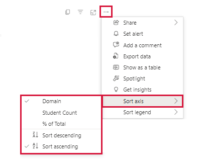
From the 'More options' menu, select ‘Sort by’ and choose from the different sorting options in the dropdown menu. These may vary depending on the type of chart.

Filter icon
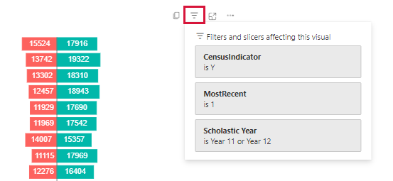
When you hover over charts or tables in Scout, a menu of options will appear on the top right-hand side.
From this menu, hover over the 'Filter' icon to see a list of the chosen filters or slicers affecting that chart or table.

Focus mode
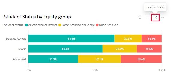
Enlarge individual charts or tables within a report by selecting the ‘Focus mode’ icon on the top-right side of the chart.

Exporting for further analysis
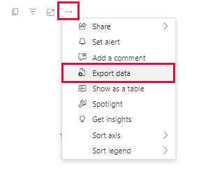
When you hover over a chart or table, select the three dots or ellipsis (...) icon that appears in the top-right corner. This is the ‘More options’ menu.
Select ‘Export data’ to export the selected table to an Excel file. This function is not available on every report.
