Managing cognitive load through effective presentations
This resource was originally published 14 October 2019.
Read online
Slide 1 - title
Slide 2 - contents
- Brief introduction to cognitive load theory.
- Strategies to optimise cognitive load in the classroom.
- Practical tips to consider when creating presentations.
Slide 3 - introduction to cognitive load theory
- Limit to how much new information the brain can process at one time.
- No known limits to how much information can be stored in long term memory.
- Supports explicit models of instruction.
Slide 4 - understanding how the brain processes information
The human brain can only process a small amount of new information, but can process large amounts of stored information.
Information is processed in the working memory, where we hold small amounts of new information for a very short time. The average person can only hold on to around seven chunks of new information in their working memory at a time, and can only work on about four chunks at a time.
Information is organised and stored in our long-term memory in ‘schemas’. A schema can be very simple with only a couple of pieces of information, or very complex with an enormous amount of information.
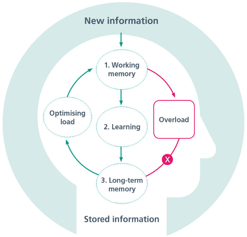

Slide 5 - optimising cognitive load
Slide 6 - Strategies to optimise cognitive load
- Tailor lessons according to students' existing knowledge or skill.
- Use worked examples to teach students new content or skills.
- Gradually increase independent problem-solving.
- Cut out inessential information.
- Present all essential information together.
- Simplify complex information by presenting it orally and visually.
- Encourage students to visualise concepts and procedures they have learnt.
Slide 7 - strategies to use when creating presentations
- Cut out inessential information
- Present all essential information together
- Simplify complex information by presenting it orally and visually.
Practical ways to improve presentations and optimise load
Slide 9 - Cut out inessential information
Slide 10 - Stick to key words and avoid blocks of text
Slide 11 - Present text in a way that is easy to read
- Use dot points
- Avoid overuse of capital letters
- Keep text left-aligned.
Capital letters can be jolting for a reader, and using all capital letters can make text harder to read, as there is less shape contrast.
It is more difficult to read centre-aligned text, as the eye has to move about to find where the line starts. With left-aligned text, the eye does not have to work as hard.
Slide 12 - Present all essential information together
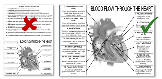

Slide 13 - simplify complex information by presenting it orally and visually
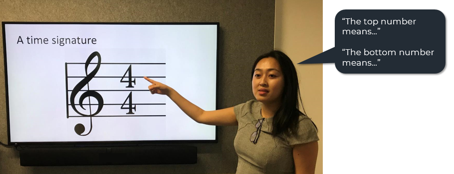

Slide 14
Slide 15 - Use symbols or text to highlight important information
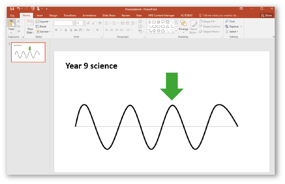

Slide 16
Slide 17 - break information into parts
- pausing
- cutting into segments
- asking questions in between segments.
There are tools online that can help you to cut YouTube videos into sections, or begin a video at a certain point.
Slide 18 - use simple animation to control the pace of information
- Try revealing one dot point at a time
- Pause to let students read the information
- Ask questions to ensure the information has been understood before moving onto the next point.
Slide 19 - Write clear headlines that summarise or tell a story
Slide 20 - When assigning tasks, leave the instructions up for students to refer to
- Choose a presentation that you use in your practice
- Use the checklist to review it
- What could you change?
- What should stay the same?
Ask staff to discuss their responses in pairs or in small groups - 5 minutes.
Activity
Checklist
- Cut out inessential information
- Stick to key words
- Use dot points
- Avoid overusing capital letters
- Left-align text
- Present all essential information together
- Move text you plan on reading out into the notes section
- Use symbols to highlight important information
- Try to display information visually
- Break complex information into parts
- Control the pace of information
- Tell a story with headlines
- Keep instructions visible.
This resource was created thanks to Victor Newby and Alice Leung from Concord High School.
Their original presentation on cognitive load informing the use of technology at their school was the basis on which this presentation was created.